Hoax Museum Makeover

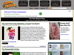
Every few years I decide the site needs a makeover. And recently I felt that feeling growing within me, so that's what I've been doing for the past few days.

The primary change has been to provide only summaries of the blog posts on the front page, rather than the posts in their entirety. This makes it easier to see what's been posted recently. I decided this was the way to go after realizing that a lot of visitors to the site would look only at the top post and miss all the posts below it.

I also centered the entire site in the browser window, rather than having it hug the left-hand side.

Hopefully none of these changes will prove disruptive in any way!

Miscellaneous

Posted on Wed Apr 09, 2014


Comments

It does look a lot cleaner!
Posted by Smerk  on  Wed Apr 09, 2014  at  07:20 PM
Actually, I would like to make a suggestion/request - on the main blog page, once you've logged in, could the Profile-Log Out-Contact box be moved to the top of the page, rather than buried below the blog archive?
Posted by Smerk  on  Wed Apr 09, 2014  at  07:40 PM
Good idea! Done.
Posted by The Curator  in  San Diego  on  Fri Apr 11, 2014  at  06:52 AM
Ooh.. nice! Very clean.
Posted by Robin Bobcat  on  Sat Apr 12, 2014  at  01:14 PM
Putting everything "below the cut" makes me not want to read below the cut.
Posted by Bill the Splut  on  Wed Apr 16, 2014  at  09:59 AM
Part of my thinking is that formatting in this way will encourage me to make more frequent, shorter posts -- which don't need to be read "below the cut".
Posted by The Curator  in  San Diego  on  Wed Apr 16, 2014  at  02:24 PM
Commenting is not available in this channel entry.